

As a leading SaaS marketing agency, we spend a lot of time looking at SaaS pricing pages.
We know how much strategy and planning goes into building SaaS pricing packages, and just as much thought goes into presenting them.
Selling virtual tools means that your online presence has to be spot-on. And when your marketing qualified leads (MQLs) make it to your SaaS pricing pages, ready to purchase, it’s important to continue delivering an outstanding experience.
A major part of SaaS marketing is around communicating your solution’s positioning and value through carefully planned messaging.
Still, when differentiating between SaaS pricing packages, it’s hard to convey the differences in plans to users who haven’t experienced your product fully.
What should you include on your SaaS pricing page?
Before we get any further, let’s understand what elements you should include in a SaaS pricing page. Evernote’s pricing page includes the following:
- Pricing tiers. This helps display different features and capabilities that come with each pricing option and clearly visualizes the ‘Good, Better, Best’ offerings clearly. Kalungi built a website theme designed for SaaS companies, and our pricing page includes tiers for your Hero, Decoy and Anchor.
- A strong headline. Communicate your value proposition and capture your audience’s dreams.
- Meaningful naming. The names of your SaaS plan should help guide users to a decision, and reflect the ‘job-to-be-done’ of each of your pricing tiers.
- Annual payments. Encourage upfront, annual payments rather than monthly payments for your SaaS products to improve ARR and reduce churn rates. Include a toggle for users to select which payment option works best for them.
- Freemiums. You should allow your users to sign up for no payment, and then upgrade when they’re ready. This allows you to scale at your own pace and reduces funnel friction for hesitant buyers.
- FAQs. Give your audience resources to learn more. Including a FAQ section can help provide your prospects with support if they’re stuck, and detail more complex elements of your pricing options.
- CTAs. You should always include CTAs to easily convert visitors into customers. Include CTAs in bright colors around your pricing tiers to direct prospects through the decision and purchase stages of the buyer’s journey.
- Features. Using a simple diagram or chart, make sure you include a breakdown of what each pricing package offers & how they vary.
- Provide currency conversion information. Chances are, some of your SaaS customers won’t use the USD. Make sure to provide currency information available for buyers around the world.
- Cohesiveness. Your branding, page layout, and copy should all resonate with your audience’s fears, dreams, and needs.
Now that we know what to look for in an effective, high converting SaaS pricing page, let’s explore more in-action.
Here are the top 11 SaaS pricing pages of 2022!
11 top B2B SaaS pricing pages of 2022
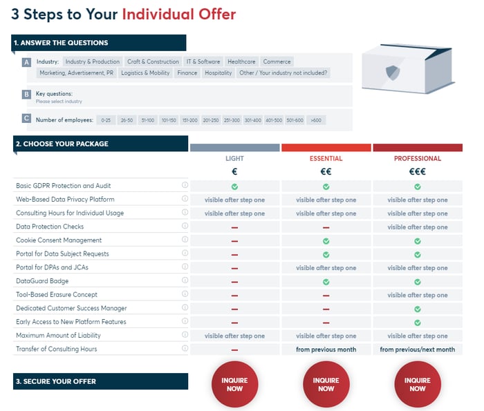
1. Dataguard
Dataguard’s pricing page offers an interactive questionnaire to determine the package best for your organization and goals. The Dataguard pricing page also includes a benefit breakdown analysis, social proof, frequently asked questions, and many different CTAs to convert their audience.
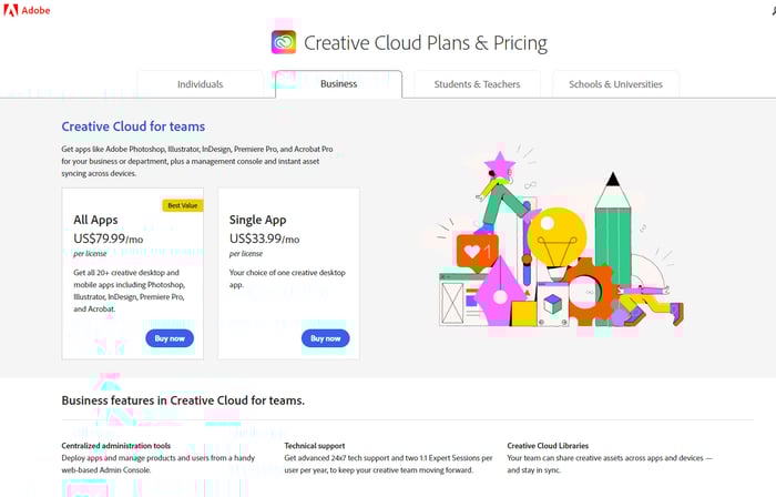
2. Adobe
Adobe delivers a clean, simple pricing page for users with pricing plainly stated. This is a very user-friendly pricing page and denotes which pricing plan they suggest through the ‘best value’ tag.
Rather than overwhelming this page with information, they segment by persona—individuals, businesses, students/teachers, and schools/universities—to connect directly with their personas.
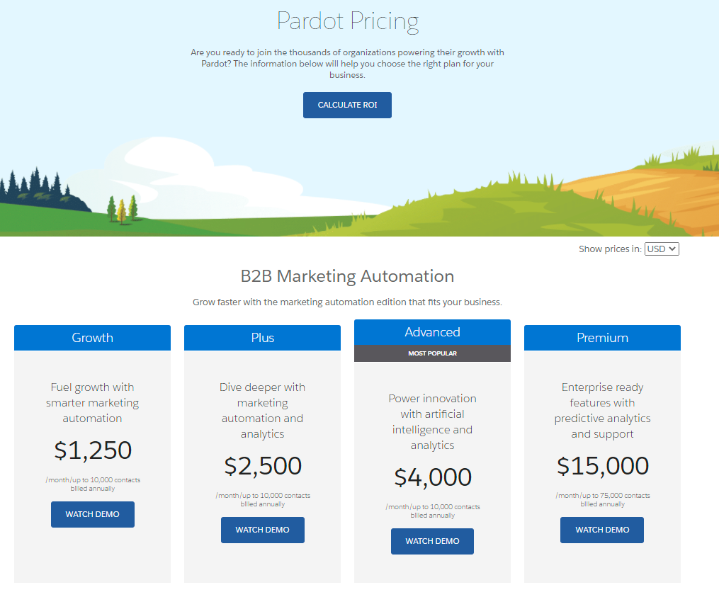
3. Salesforce Pardot
Salesforce Pardot’s pricing page includes concrete numbers (which users are looking for), and a ‘Watch Demo’ CTA at the bottom of each pricing tier. They also speak in ‘benefits’ rather than ‘features,’ helping nurture prospects to convert and reinforce the value of their SaaS product(s).
They also include a ‘most popular option, helping first-time customers understand which package might be best for them.
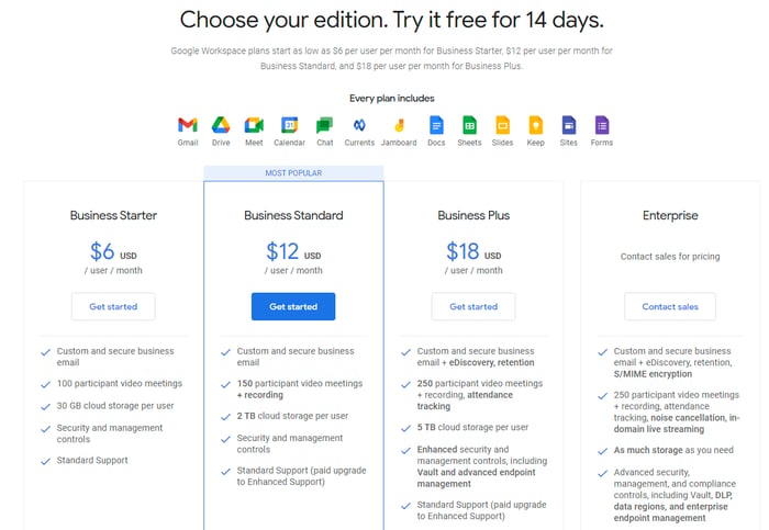
4. Google Workspace
Google uses intuitive design, lots of white space, and highlights the key value propositions across each pricing package. Their pricing page also includes graphical images of what’s included with each plan, and clear CTAs to get started once they determine what package customers want.
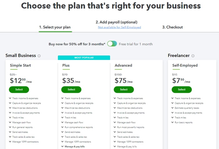
5. Intuit Quickbooks
Intuit’s Quickbooks pricing page is very unique—offering prospects three months at a 50% discount or one month free. This gives readers the ability to pick what works for them, in addition to the pricing tiers.
We also like that they have the payment steps outlined on the top—selecting your plan, adding payroll, and checkout—to make sure that prospects don’t experience fatigue before getting to checkout.
Finally, Intuit uses great labeling options with ‘Simple Start,’ ‘Plus,’ ‘Advanced,’ and ‘Self-employed’ to easily attract the right audiences to the right packages. All in all, this pricing page is a hit!
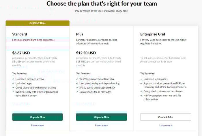
6. Slack
Slack’s pricing page is wonderfully simple. With ‘top features’ and the price explicitly detailed. This makes for a scalable, transparent SaaS pricing model that’s allowed Slack to become a leading communication platform.
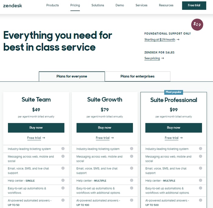
6. Zendesk
Known for their dedication to customer success, Zendesk’s pricing page is intuitive and easy to use. They include a toggle option for enterprises at the top, include two CTAs per pricing tier, and plenty of information to inform prospects about their options. ZenDeck’s pricing page also includes a ‘Most Popular‘ tag over their last package to reduce friction along the funnel even more.
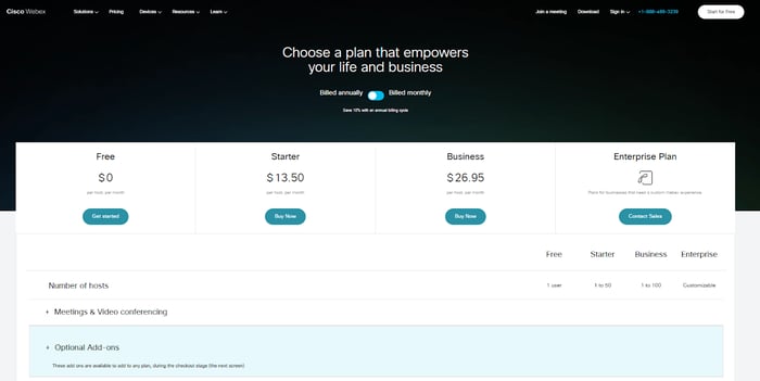
7. Cisco Webex
With a killer H1 tag and a toggle for annual and monthly billing, plus product benefits are broken up into expandable categories, it’s easy to get exactly what you need. It’s simple and intuitive, yet contains everything relevant to a SaaS buyer as they navigate their options. Cisco’s pricing page is an excellent example of a high-converting, low-friction content and design.
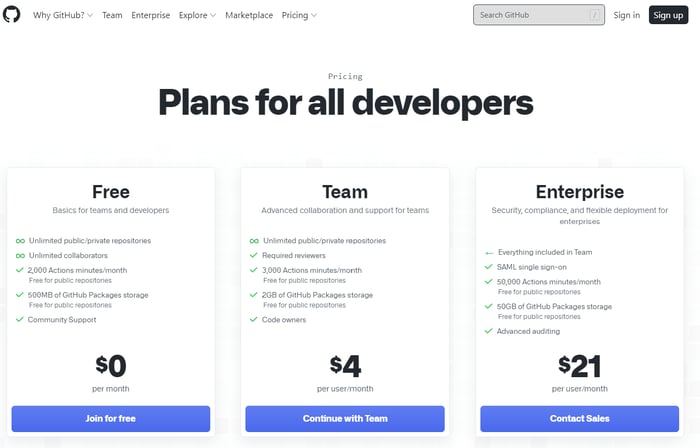
8. Github
This pricing page directly speaks to their primary persona—developers—and uses plenty of white space, with bright pops of color where they want to draw your eyes. They also skillfully use iconography under each pricing option to illustrate the value of their offerings.
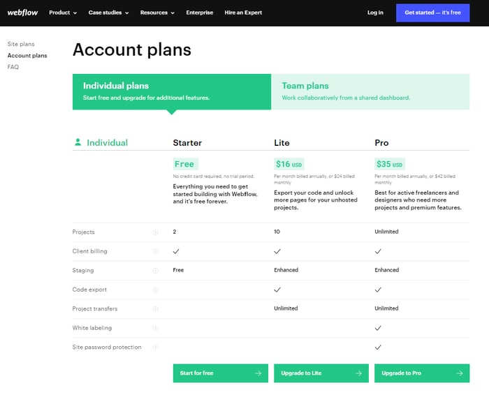
9. Webflow
This SaaS pricing page was recommended to me by Kalungi’s head of product and design. Needless to say, it’s definitely a top SaaS pricing page of 2022.
The microcopy scattered throughout the page provides the perfect level of detail for users as their eyes travel across the screen, and the page also includes a table of contents on the left-hand side of the screen with an FAQ section.
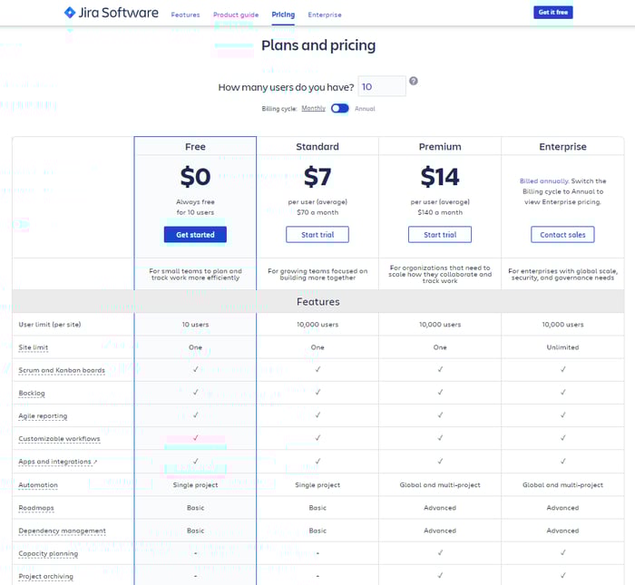
10. Jira
This SaaS pricing page follows all of the SaaS pricing best practices: your payment toggle at the top, your CTA embedded at each touchpoint, and a feature analysis by pricing tier. What’s more, they’ve included an option to input exactly what you’ll be paying for your unique needs with the textbox above the toggle.
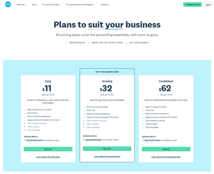
11. Xero
This list was supposed to contain 10 SaaS pricing page examples but I wanted to include an honorable mention—Xero! They leverage microcopy, iconography, and clear pricing options and indicate which audience each pricing plan is best for.
Xero also highlights the middle column as their most popular pricing plan and includes the option to learn more about the unique pricing plans. All in all, this pricing page suites Xero’s products and offerings for SaaS buyers.